Foundry
Limitype ©
A fat, bold, heavy display typeface with a strong & wide visual presence. Built to dominate the page.
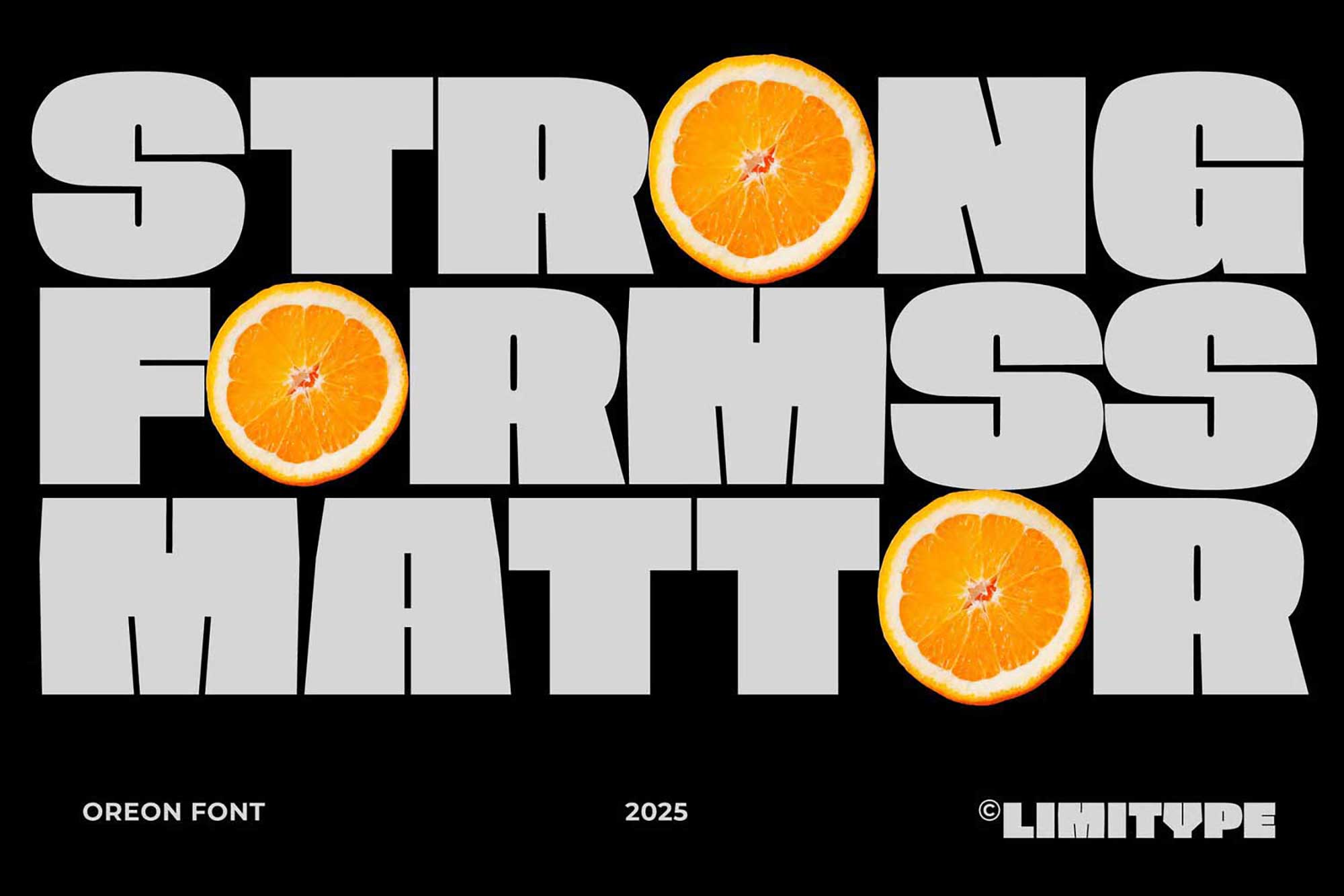 ↑ Actual Oreon — Strong Forms Matter
Ultra-fat strokes and a towering x-height. Oreon fills every counter and presses against the baseline.
Rounded terminals and broad shoulders. A 70s-grade swagger engineered for posters, packaging and headlines.
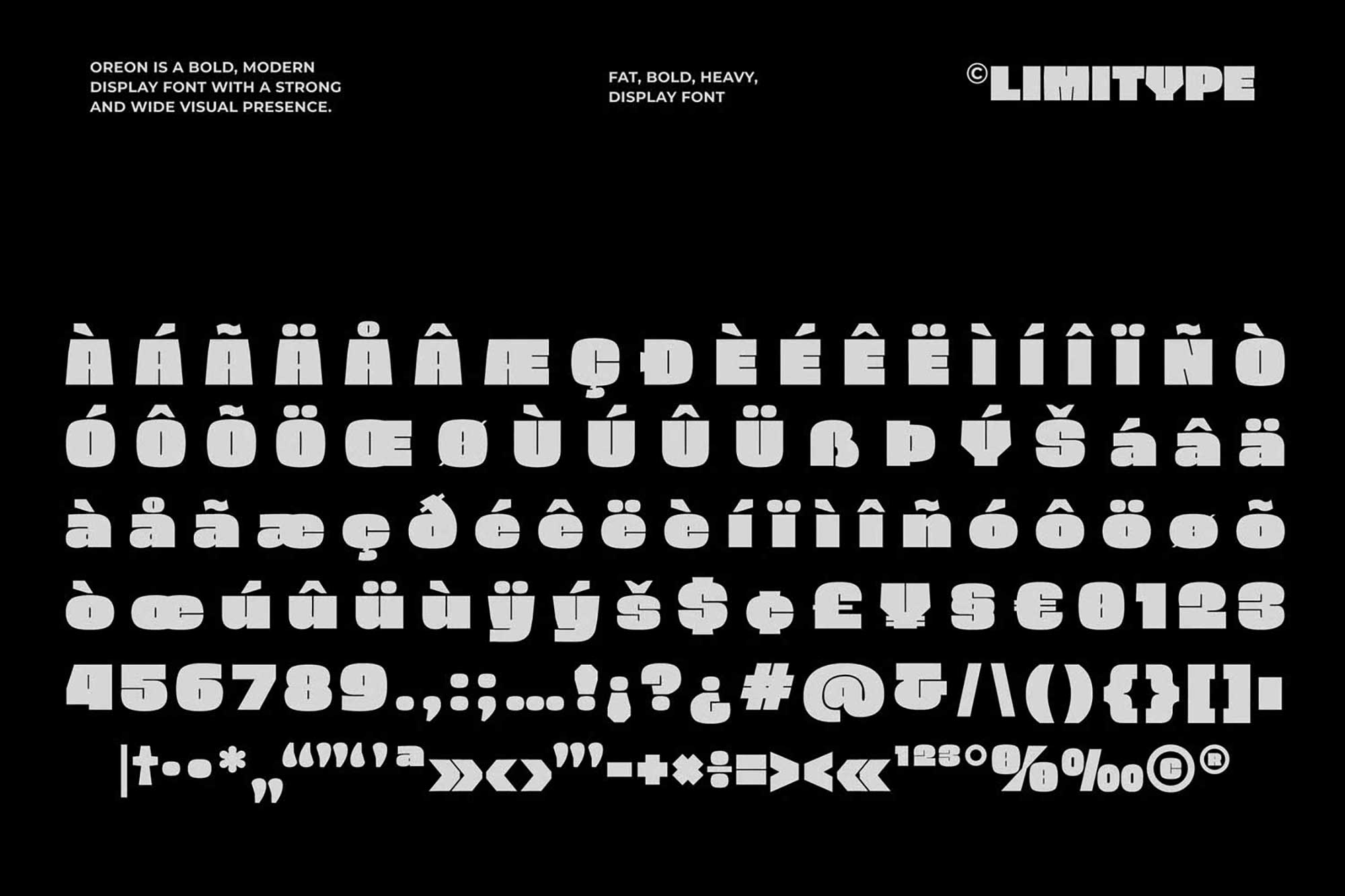
Full uppercase, lowercase, extended Latin diacritics, numerals and a heavy set of symbols. Multilingual ready.
Uppercase, lowercase, diacritics, numerals & symbols — rendered in the real Oreon. Wide, fat, unmistakable.
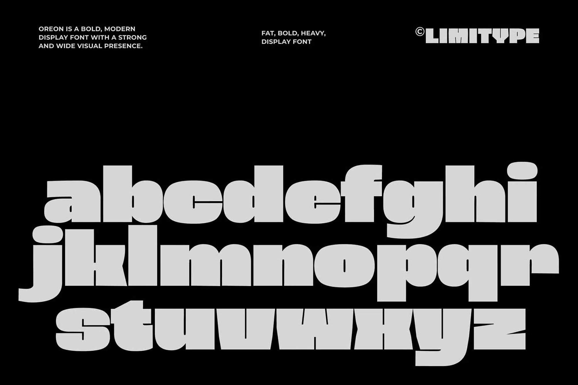
Type below and watch Oreon swell. Drag the size, snap the weight, break the grid.
Packaging, apparel, signage, sport. Oreon was made to be printed loud.
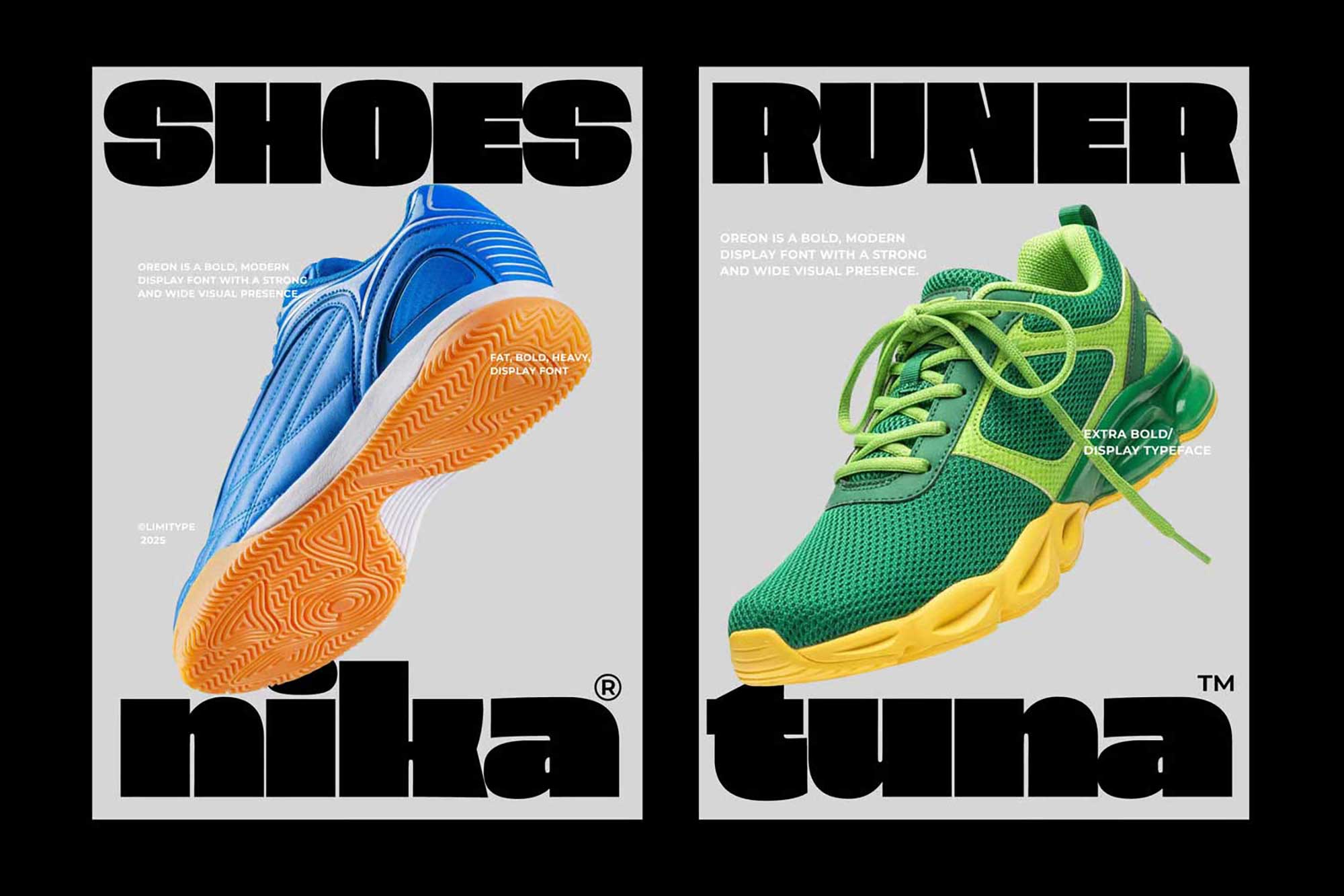 Posters — Nika / Tuna
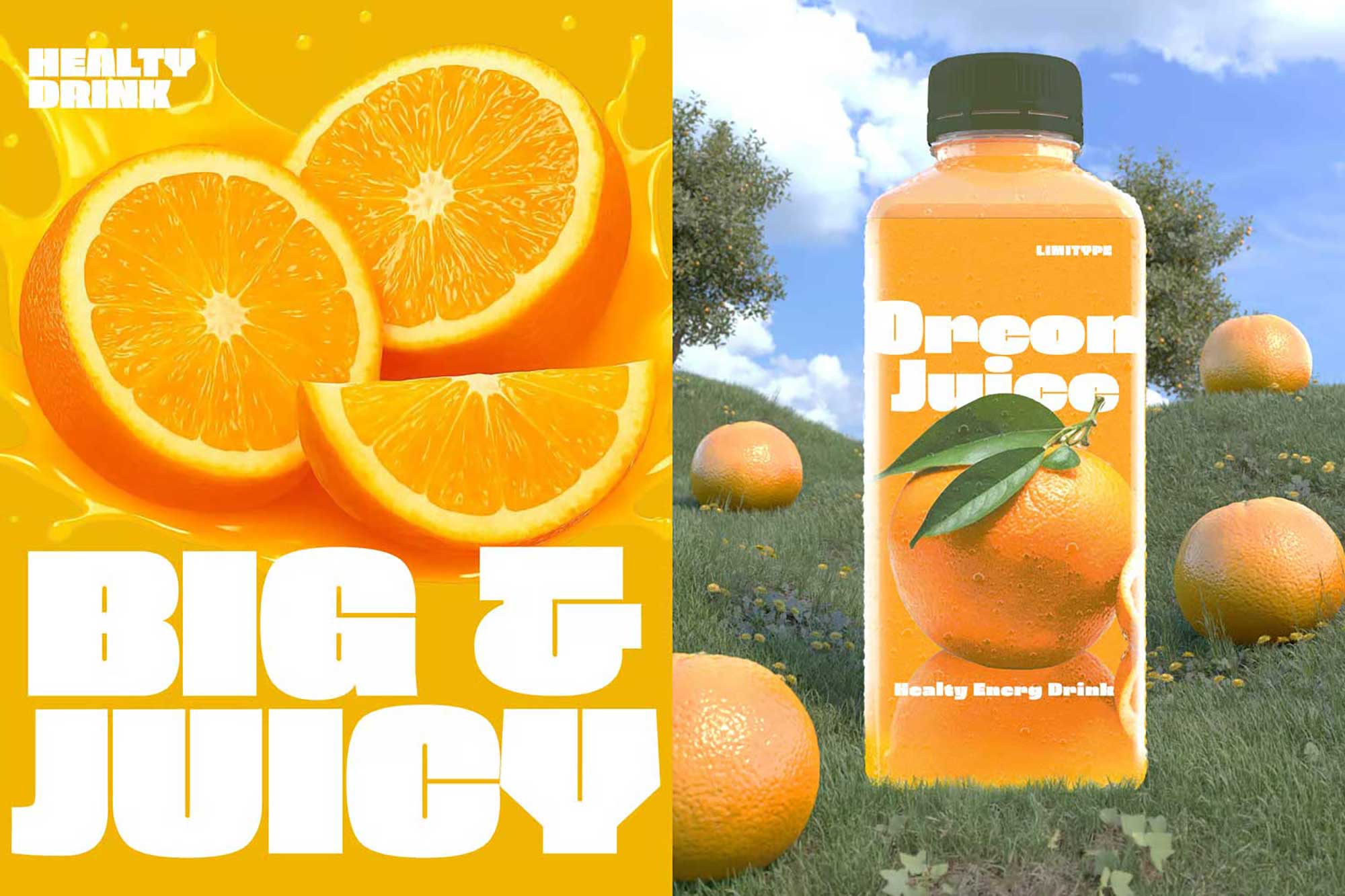 Packaging — Oreon Juice
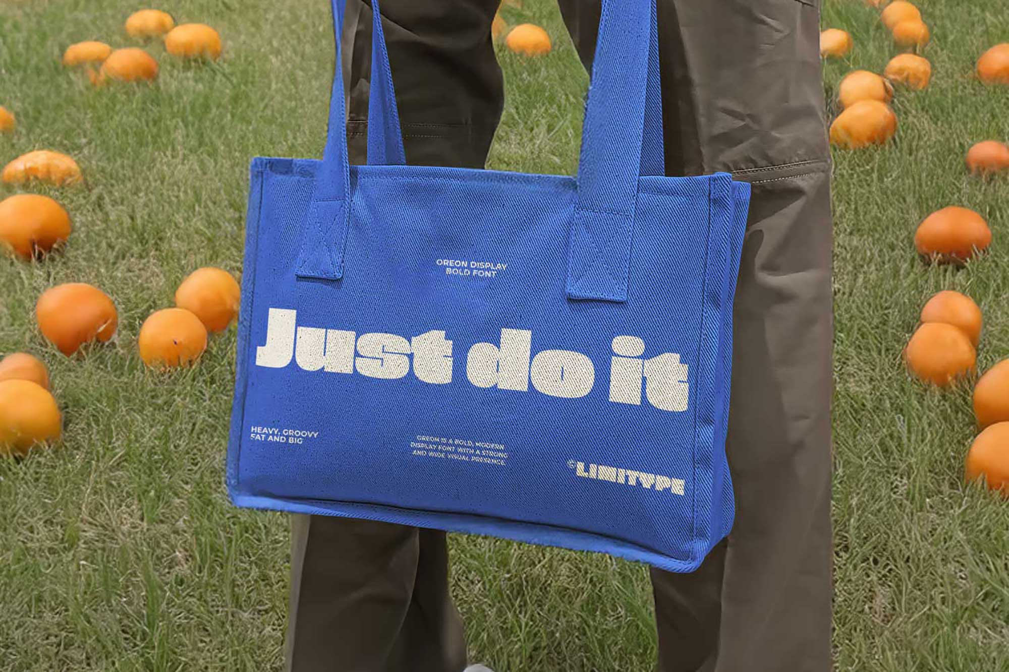 Apparel — Tote
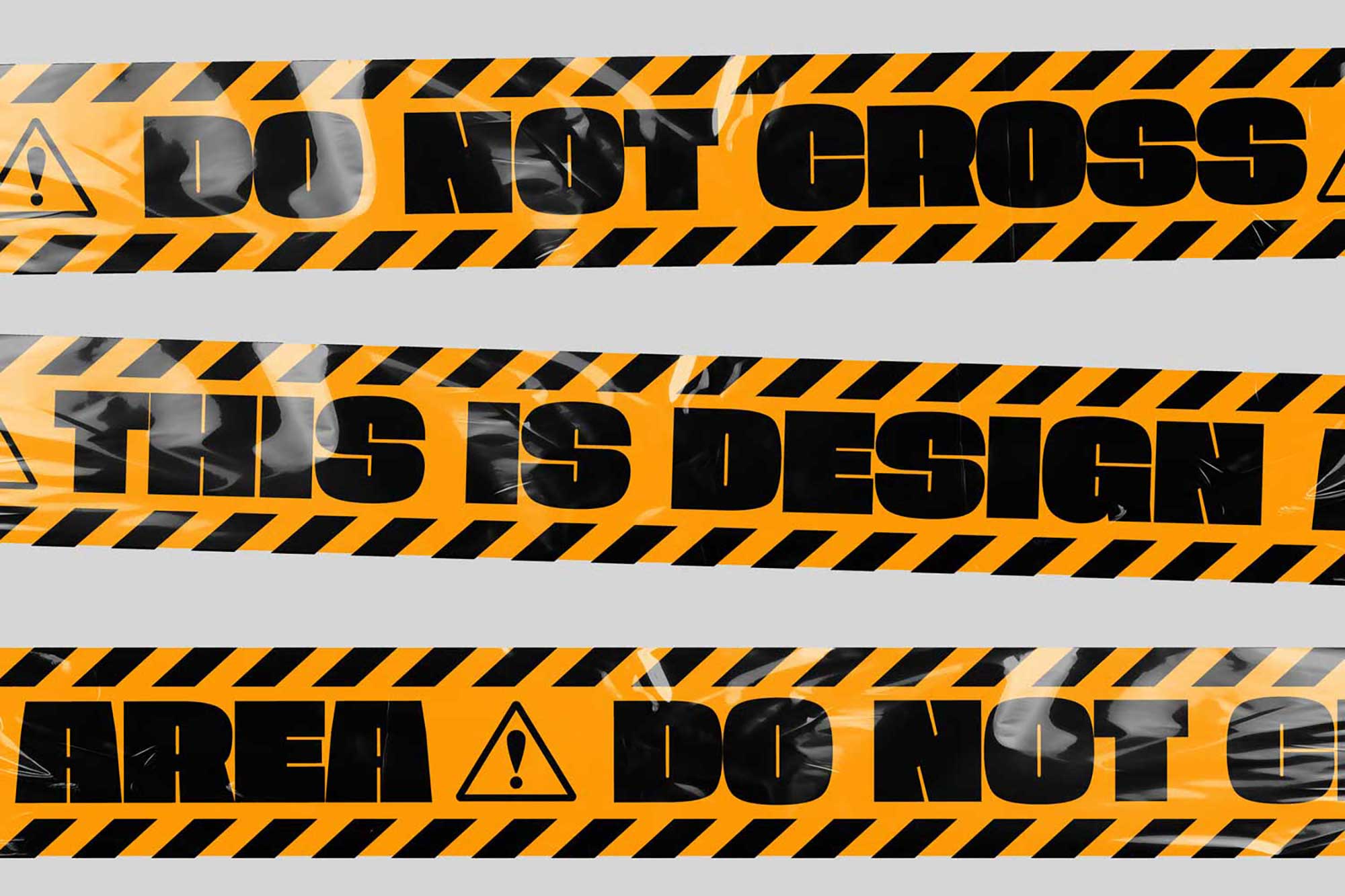 Signage — Caution Tape